L&C Mortgages
Tools
Figma
Webflow Optimize
Claude
SEO/AEO
GA4/GTM
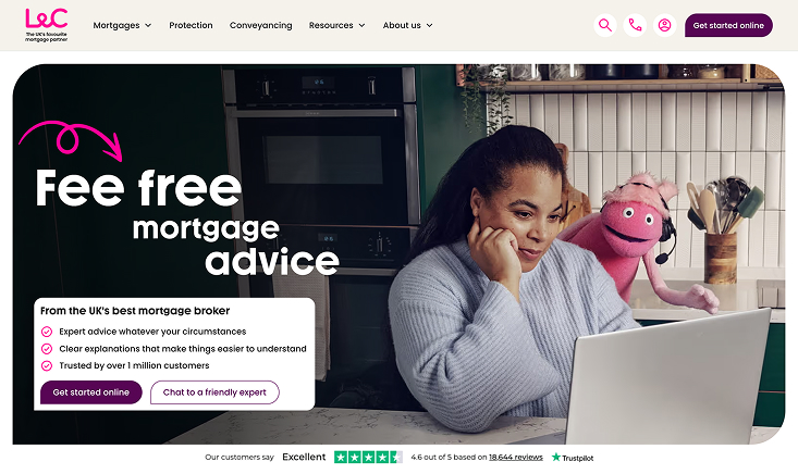
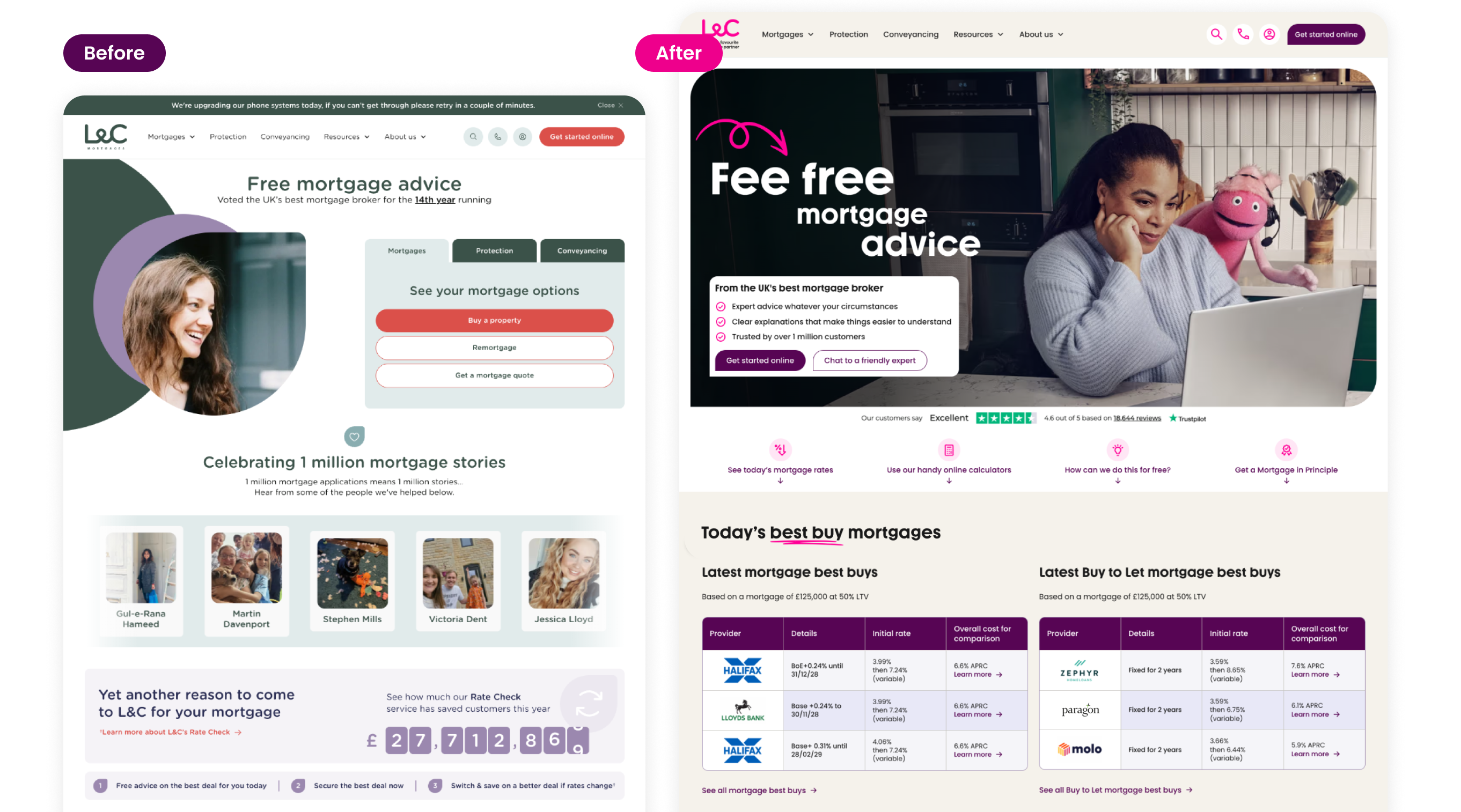
Since joining L&C Mortgages in January 2026, I’ve helped reshape how people start their mortgage journey online. I led the website rebrand launched in May, redesigned our interactive calculators, and created a new mortgage quiz that helps customers get answers faster and reach an adviser sooner. Alongside this, I lead ongoing improvements across the site, from A/B testing to SEO and AI search.
Calculators are one of the first places people go when they start thinking about a mortgage, but ours weren't giving them answers quickly enough.
- Results weren't instant. Users had to fill in every field and click Calculate before seeing anything, so there was little reason to explore different numbers. The next step was a small text link that was easy to miss.
- High bounce rates. The calculator pages got lots of search impressions but had a 65–80% bounce rate, a sign that it didn't match what people were searching for.
- Little insight into behaviour. We couldn't easily see which fields people used or where they dropped off, so improvements were based on guesswork.
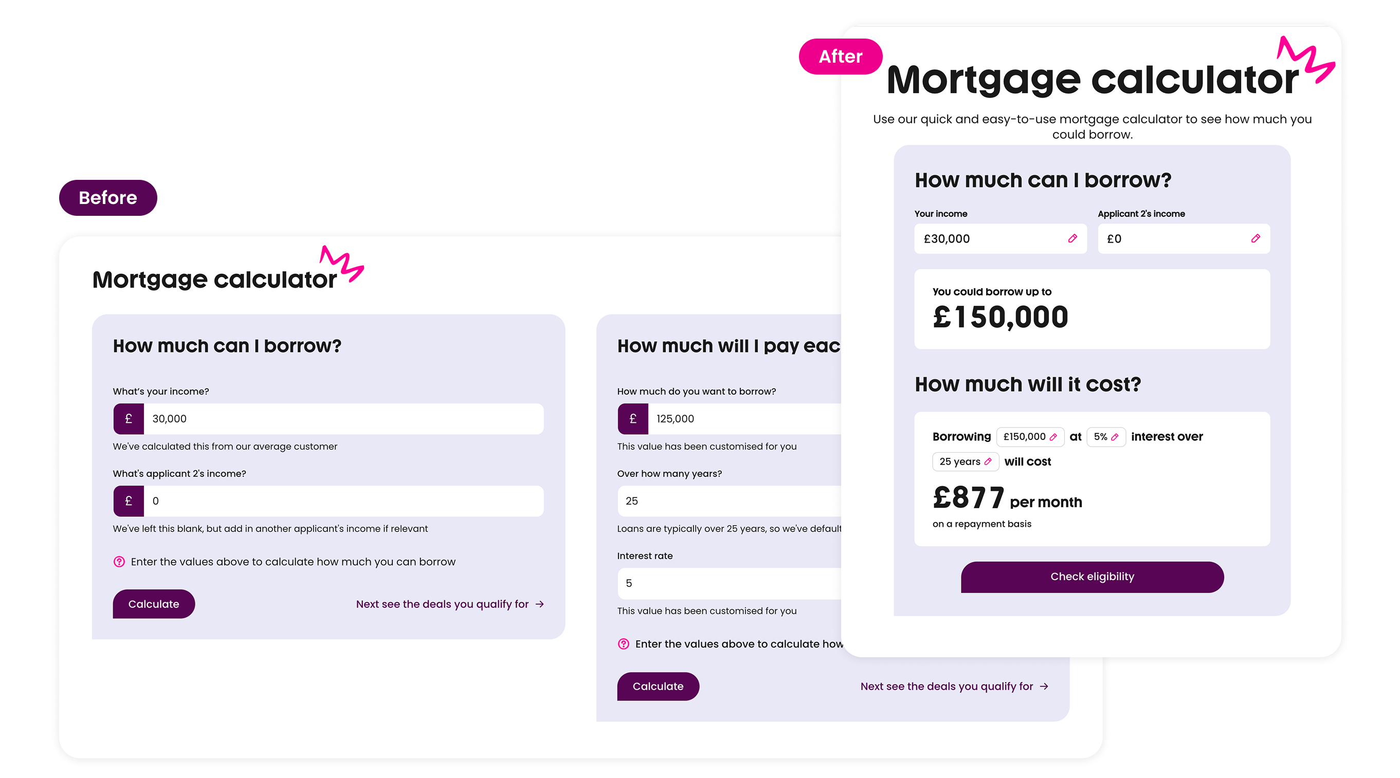
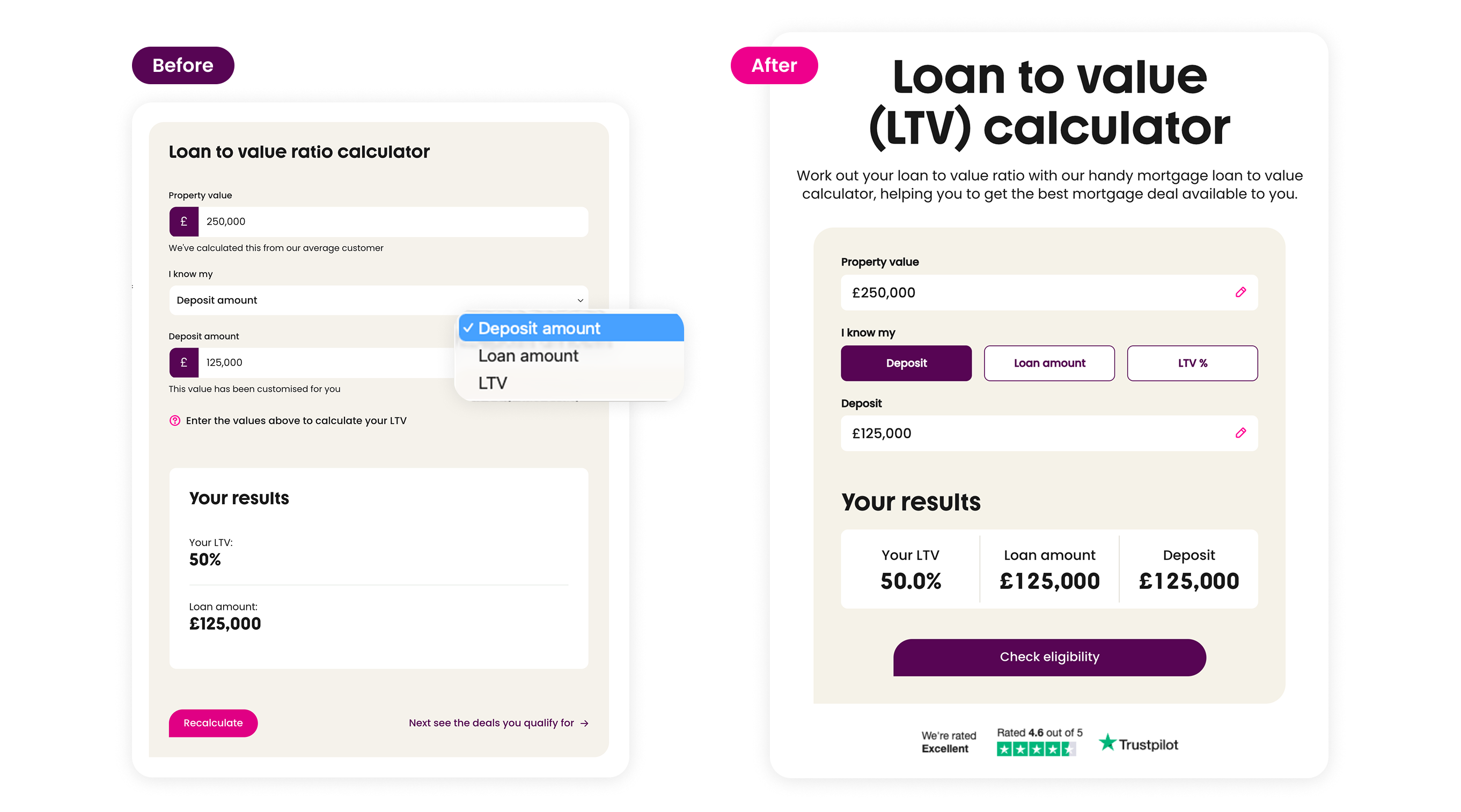
The new calculators show results instantly, combine related questions into one simple flow, and guide users to a single clear next step, with less effort and more confidence along the way. Removing the Calculate step significantly reduces the number of clicks needed to get an answer.
- Instant results. Results update live as users type, with no Calculate button to click. A slot-machine style number animation draws the eye to each change, so users instantly notice that their result has updated.
- One clear next step. A prominent "Check eligibility" button replaces the small text link.
- Clearer hierarchy. Results appear in large, bold numbers, so the answer is the first thing people see.
- Simpler layout. Less helper text and fewer buttons, with pencil icons showing which values can be edited.
- Tracking. Set up GA4, GTM and Webflow Optimize tracking across all calculators, so the team can see where people engage and where they drop off.
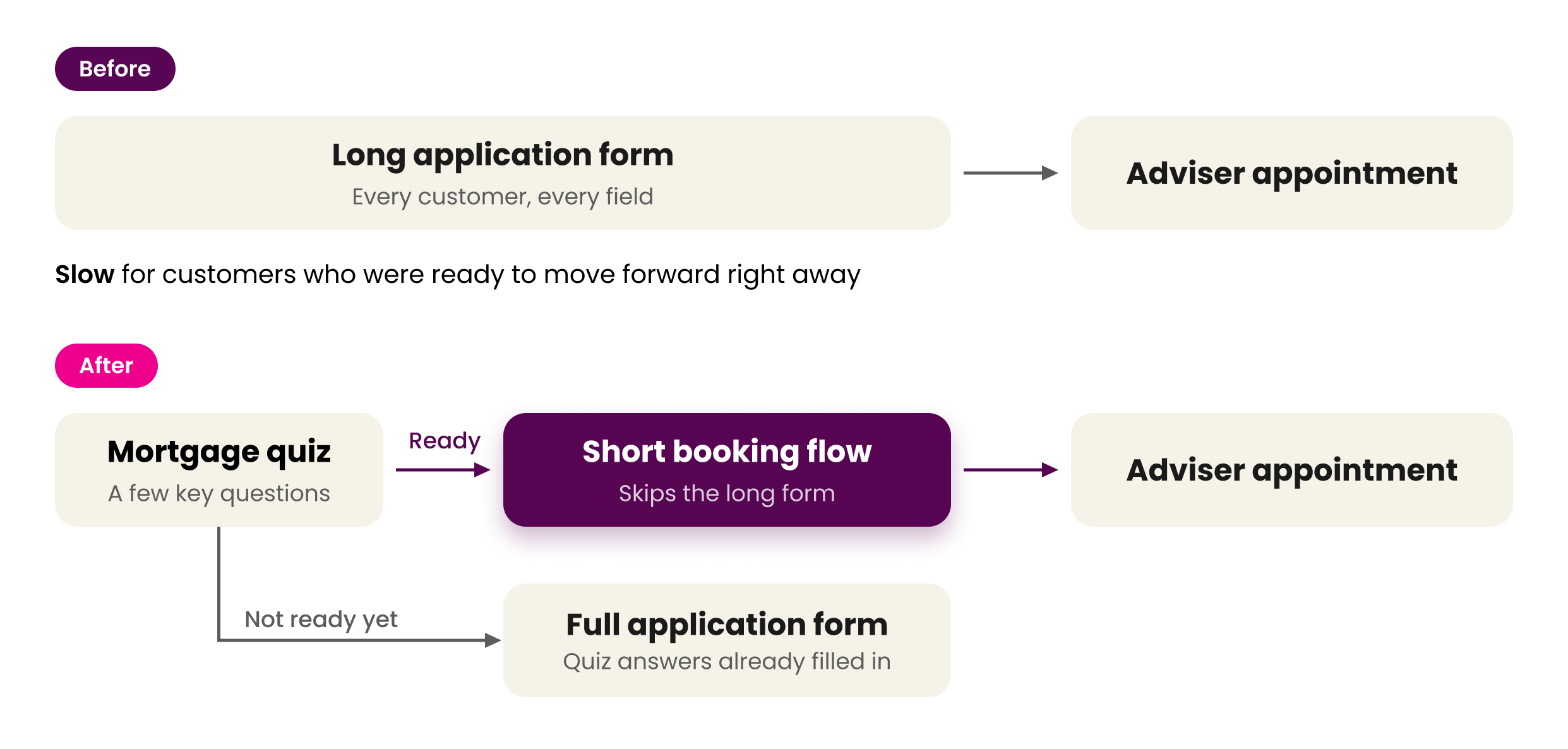
Customers who were ready to move forward still had to complete a long form before they could book time with a mortgage adviser. That slowed them down at the moment they were most motivated, and made it harder to keep advisers' diaries full.
The goal: spot customers who are ready to proceed and give them the fastest possible route to an adviser.
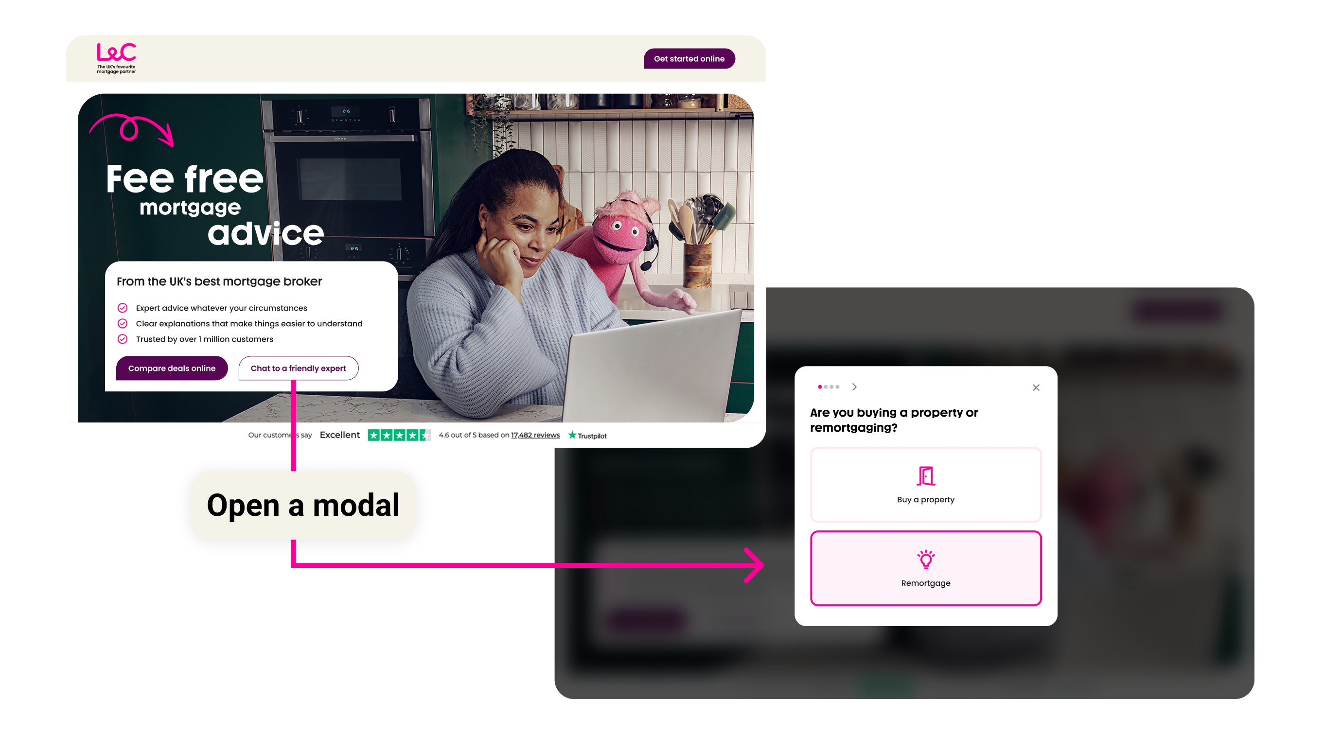
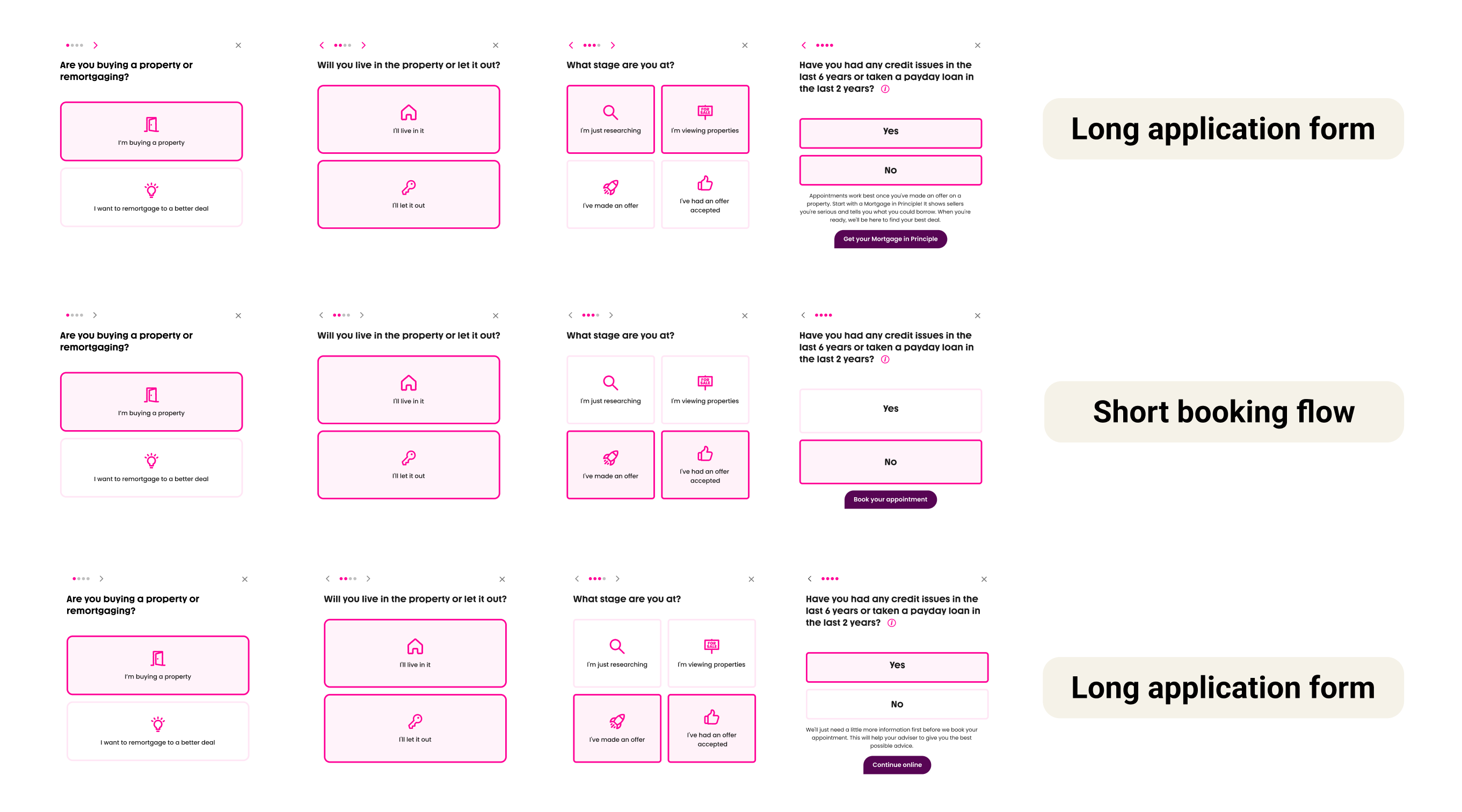
- A faster route to a mortgage adviser. Customers who are ready to proceed skip the long form and go straight to a short booking flow.
- Less effort up front. A few key questions replace a long form as the first step, so starting feels quick and easy.
- No repeating information. Customers who don’t qualify for the short booking flow continue to the full application form, with their quiz answers, such as buyer type, already filled in. They never have to enter the same details twice.
- Clear insight into every step. GA4/GTM tracking shows the team where people engage and where they drop off.
- Accurate partner attribution. Partner referrals are now recorded correctly, after fixing code that was crediting the wrong source.
These projects are part of wider, ongoing work to make the L&C website easier to use and easier to find.
- A/B testing programme. Plan, build and analyse tests in Webflow Optimize, including custom conversion tracking. Tests include the hero eligibility stepper, a calculator redirect and the Mortgage in Principle page.
- CRO redesign. Lead the redesign from final mockups, structuring content for both users and AI search tools.
- SEO and AEO. Add structured data, made content readable for AI crawlers, and planned a hub-and-spoke URL structure to fix keyword cannibalisation.
- Site-wide tracking. Set up GA4/GTM tracking for key interactions, such as the best-buy rates table, and created a shared tracking plan.